
How to Read a Fly Fishing Tee: What the Species, River, and Colorway Actually Signal
By Bobby Harris — Navy FMF Corpsman (2002–2010), founder of First Rise Outfitters
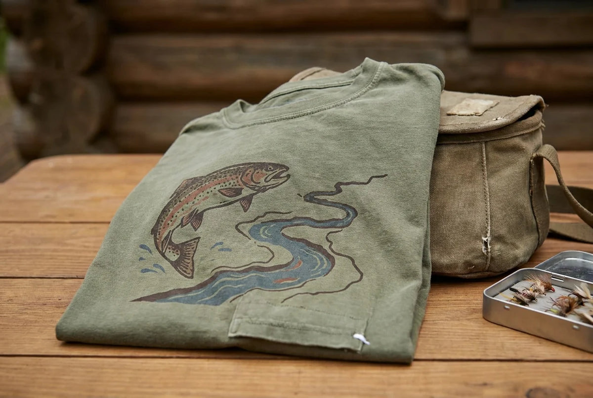
Walk into any fly shop, pull up to any tailgate at a river access point, or scroll through any serious angler's feed, and you'll notice something. The fly fishing tee shirts people wear aren't random. They're a conversation happening in plain sight, and if you know how to read it, you learn a lot about the person wearing the shirt before they ever say a word about their fishing.
A graphic tee is shorthand. The species on the chest, the river name along the hem, the washed-out colorway that may or may not have earned its fade, all of it signals something to anyone who knows the language. Buy the wrong shirt and you're wearing a trend. Buy the right one and you're wearing a place, a fish, a season, maybe even a specific hatch time.
This piece is about learning that language. We'll cover what species choice signals, why geographic specificity matters, what colorways and printing techniques reveal about a brand's intentions, and how to read conservation messaging for what it actually says. By the end, you'll shop like someone who reads water, not labels.
The Shirt as Shorthand

Reading water works the same way. A beginner sees a river. Someone with years of wade time sees feeding lanes, seams, and temperature gradients. The pattern recognition builds slowly, but once it's there, you can't unsee it. Outdoor graphic tees work on the same principle. The signals are legible once you know what to look for, and the difference between a shirt built around a real fish in a real river and one built around a trend is often obvious within seconds.
It also connects to values that go past aesthetics. How a shirt is printed matters to anyone who cares about what lasts and about what goes into the water. The four signals covered here -- species choice, geographic specificity, colorway, and printing technique -- are the shorthand version of that evaluation.
Species Choice: What Fish Is on the Chest and Why It Matters
Start with species, and the signal sharpens fast.
A rainbow trout on a chest print is recognizable to almost anyone who has spent ten minutes near a fly shop. That's exactly the problem. Rainbows are stocked widely across the country, from eastern hatcheries to western rivers. A rainbow silhouette says trout angler at best; it says nothing about where, or how seriously.
Put a brook trout on that same shirt and the geography collapses into something specific. Brook trout are native to cold, clean headwaters in the eastern U.S. and Great Lakes drainages, among other regions. They don't survive where conditions are compromised. A brookie design isn't decoration; it's a habitat statement. A cutthroat carries similar weight. With multiple subspecies distributed across distinct western ranges, cutthroat imagery points toward the Rockies, the Snake, the Green, or high-country drainages that take real effort to reach.
Native species matter more than widely distributed ones for exactly this reason. They're tied to specific, often pressured places. That association carries meaning for anglers who understand what it takes to find them.
Illustration accuracy sharpens the signal further. A correctly rendered brown trout -- one that looks like it was sketched streamside, not copied from a clip-art library -- reads as genuine to anyone who has studied one in hand. A generic shape that could be a bass or a salmon tells you the designer was working from a clip-art library, not a streamside sketch.
Independent sellers on platforms like Etsy maintain dedicated categories for species-specific fly fishing tees, including salmon fly shirts, because anglers search by species. They know what they're looking for.
Designs that collapse all trout into one interchangeable silhouette were built for shelf appeal, not for someone who drives four hours into a national forest to chase a specific fish in specific water. The First Rise Outfitters Field Notes approach to species-rooted design starts from the same premise: if the fish isn't accurate, the shirt isn't honest.
River Names, Water Types, and the Signal of Place
Species narrows the conversation. Place closes it.
A river name on a hem works as a fast filter because not all river references carry the same weight. A famous tailwater on a mass-market shirt tells you almost nothing; that name sells itself. But a reference to a small public-land tributary, a lesser-known freestone drainage, or a Wild and Scenic corridor most anglers have never heard of signals something different: someone was actually there. They know the access points, the regulations, the seasonal flow. The name earned its place.
Geographic specificity runs deeper than a proper noun. Water type references do real work. Freestone, tailwater, spring creek: these aren't interchangeable labels. Freestone streams run on rainfall and snowmelt, with variable temperatures and opportunistic fish; tailwaters below dams hold stable flows that produce selective, year-round hatches; spring creeks are groundwater-fed, nutrient-dense, and technically demanding. A designer who understands those distinctions and builds one into the work is communicating fluency. One who ignores them is guessing.
Hatch references sharpen the signal further. A design built around "Hex:30" shorthand for hexagenia emergences at dusk on warm June evenings across Midwest and Great Lakes rivers means nothing to a casual buyer. A Great Lakes angler who has stood waist-deep on the Au Sable waiting for that emergence reads everything.
Shirts that reference public-land rivers, national park watersheds, or conservation-significant waters signal stake, not just style. The wearer has a reason to care whether those places survive. That's a different message than "outdoor vibes."
Generic apparel avoids specificity on purpose. Narrow references shrink the addressable market. That's precisely why specificity is the signal. If you want to defend the headwaters, you have to know which ones you mean.
What the Colorway Tells You
Color is where a lot of outdoor graphic tees give themselves away, and it's worth slowing down to read it the same way you'd read a rise form.
Many experienced anglers believe muted, earth-tone palettes on fly fishing shirts aren't just a style preference -- they reflect something practical about time spent on the water. A faded olive or blue-grey shirt fits the field in a way a neon graphic simply doesn't, and that fit is the point.
The more useful distinction, though, is between color that was designed to look faded and color that actually faded. One signal worth noting is whether fading looks designed or earned. Artificial distressing tends to be uniform in a way real wear never is, and that uniformity is the tell.
Environment-specific palettes go a step further. Some designers describe building color around specific conditions: a blue-grey and muted olive palette can evoke a tailwater morning, that flat light before the surface film starts moving; warm amber and cream can suggest October, dry-fly season, a freestone stream going low and clear. Designers who fish build those associations deliberately. Designers who don't tend to reach for whatever color trend is moving on retail shelves.
High-saturation, high-contrast graphics are more common in mass-market outdoor apparel, where shelf presence and thumbnail visibility drive design decisions. That's a useful signal about who the shirt was built for.
Conservation-oriented brands often tend toward restraint in color as in design. A muted palette on a trout shirt can carry the same quiet values as the species or the river in the design itself: understated, rooted, not performing for an audience.
Screen Print, DTG, and What the Technique Says About Longevity
Color tells you who made a shirt for. Print technique tells you whether it was built to last.
Screen printing and direct-to-garment printing age on different timelines. Screen printing has a long reputation for aging well -- the ink bonds at a depth that tends to soften and fade rather than peel. Lower-quality DTG production is more prone to washout or surface cracking over time, particularly with frequent laundering, which is exactly when you realize the shirt was never meant to see a river more than once.
The ink matters as much as the process. Independent outdoor apparel brands that take printing seriously tend to use water-based inks rather than the plastisol alternatives common in mass production. Water-based inks are generally associated with a softer, more breathable feel compared to heavier plastisol alternatives -- a difference some buyers notice immediately. Pick up a shirt and run your thumb across the graphic. A flat, rubbery surface is a mass-production signal. A soft print with a little depth to it suggests someone made a deliberate choice about materials.
That choice is also an expense. Brands that absorb the higher cost of quality screen printing with water-based inks are telling you something about their priorities without saying a word about them.
Stock template designs compound the problem. Graphics pulled from template libraries and dropped into DTG production for fast fulfillment tend to look it. The line weights are often inconsistent, the composition generic, the species rendering vague enough to apply to any fish in any river. Original commissioned artwork has a specificity that stock images lack, and experienced buyers tend to recognize the difference on sight, even if they can't always explain why.
The same attention that goes into reading a piece of water applies here. The details reveal the intent.
Conservation Messaging and What It Reveals About the Brand
Print quality is the last thing you can fake without someone noticing on the water. Conservation values are harder to fake than that.
A fly fishing tee that references native species protection, a specific public-land watershed, or a river facing real pressure tells you the brand is paying attention to something beyond the retail calendar. That's a meaningful distinction. Anglers who care about the places they fish pick up on it quickly, and it builds a different kind of trust than a clean logo ever could.
The quiet positioning happens at the design level. Centering a brook trout, a westslope cutthroat, or a wild fish in a conservation-stressed river isn't a neutral aesthetic choice. It's a small declaration. A brand that understands that distinction and builds it into its design choices is communicating a philosophy without needing to print a manifesto on the hem.
The Pursue. Respect. Conserve. framework from First Rise Outfitters is a useful example of how that philosophy embeds itself structurally. The values don't require an explicit callout on every garment. They show up in which species get chosen, which waters get referenced, and whether the color palette reflects the actual environment rather than a trend board.
Conservation-minded anglers read these signals actively. A reference to a river under withdrawal threat, or a species losing ground to habitat loss, registers as recognition, not decoration.
Generic outdoor imagery communicates something too, just in the opposite direction. When a design has no connection to a real fish, a real river, or any conservation stakes, it signals the shirt was built for the look. That's not a criticism of the buyer. It's just what the design is telling you.

Reading the Shirt Before You Buy It
All of that comes down to a practical question you can answer before you hand over your card.
A shirt that scores well across species accuracy, place specificity, colorway, and print quality was almost certainly made by people who actually fish.
The sharpest test is the specificity question. Would this design mean something to an angler who fishes that exact water or chases that specific species? If the answer is no, the shirt was built for decoration. That is not a moral judgment; it just tells you what you are actually buying.
It also matters who made it. Independent outdoor apparel brands with a stated connection to specific rivers, species, or conservation work are more likely to have built the design around real knowledge. Mass-market operators pulling stock imagery from a design library are building product for shelf volume, not for the angler reading the water in the background.
Finally, think about how it will age. Take a fly fishing tee into the field a dozen times and the printing technique will tell you everything the product page would not. Soft, honest fade is one thing. Cracking and washout after a season is another.
Buying intentionally means the shirt you wear on the river carries a specific meaning. So does your choice of the brand behind it.
The Visual Language Is Already There
None of this is new to you. You already know the difference between a shirt that feels right and one that feels hollow. You knew it before anyone named the four signals. You've been reading these signals already -- species, place, color, print -- every time you picked up a tee. This piece just gave the instinct a framework.
That framework matters because intentional beats decorative, every time. A fly fishing graphic tee built around an accurately rendered cutthroat, a specific spring creek, a palette pulled from a tailwater morning, and a screen print with some honest texture in the ink -- that's not just a shirt. It's a legible statement about what the person wearing it actually values.
The language was already there. Now you have the vocabulary to read it deliberately.
Conclusion
Every element of a well-made fly fishing tee points back to the same thing: real knowledge about real places, built to last. The brands doing this work honestly are worth finding. The shirts they make are worth wearing.