
3 Color Rule for Dawn Fishing: What Colors to Wear
By Bobby Harris — Navy FMF Corpsman (2002–2010), founder of First Rise Outfitters
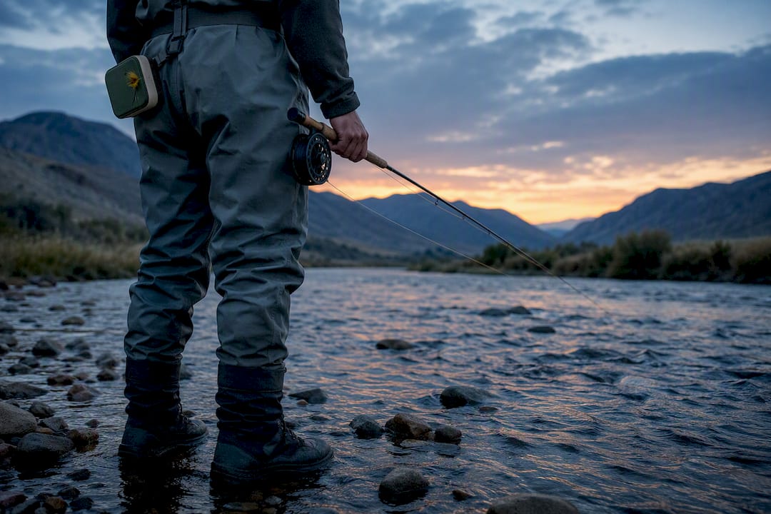
For most days on the water, your best bet is muted earth tones, tan, and soft blue-gray, worn with almost no contrast between pieces. Save any bright color for a small accent low on your body, never across your chest or shoulders. Skip neon, glossy prints, and busy patterns, especially in clear water or when you’re sight fishing. Everything after this comes down to matching those basics to your specific water and light.
TL;DR:
- Fish vision varies by species and habitat, affecting how colors appear and which shades are most effective for stealth in different water conditions.
- Wearing muted earth tones and low-contrast accents helps blend with surroundings, especially in clear water or when sight fishing, to avoid spooking fish.
- Bright colors, shiny finishes, and bold patterns increase glare and visual noise, making fish more likely to notice and avoid the angler.
- The 3-Color Rule advises choosing a muted base color, a low-contrast secondary tone, and a small, low-positioned accent to optimize stealth clothing.
- In murky or low-light water, lighter shades and UV-reactive gear improve visibility to fish, while high-visibility safety gear ensures angler safety during night or ice fishing.
Table of Contents
- What Colors to Wear Fishing in Different Water Conditions
- Why Fish See Color the Way They Do
- The 3-Color Rule for Fishing Outfits
- Balancing Stealth With Heat and Sun Safety
- Patterns and Finishes That Spook Fish (It’s Not Just Color)
- Palette Ideas Built Around Real Fishing Scenarios
- Your Pre-Trip Color and Gear Checklist
- A Dawn Angler’s Case for Muted Colors
- Where First Rise Outfitters Fits Into Your Fishing Wardrobe
- Sources
What Colors to Wear Fishing in Different Water Conditions
The right color depends less on personal taste and more on what’s under your boots. Clear water, tannin-stained rivers, open ocean, and murky ponds each ask for something different, and getting it wrong can mean spooked fish before your line ever hits the water.
Clear water and sight fishing call for the most discipline. Stick to muted earth tones, pale blue-gray, or off-white, and keep any bold color off your chest and shoulders where fish looking up can see it clearly. This is where the 3 color rule (more on that below) earns its keep, because clear water shows every mismatched panel.
Tannin-stained rivers, the kind that run the color of steeped tea, give you a little more room. Olive and tan blend naturally with the bank and bottom, and a small chartreuse accent on a zipper pull or hat brim won’t stick out the way it would in gin-clear flats.
Offshore and open water reward slate blues and deep neutrals, especially in matte finishes. Glossy prints and shiny piping catch sun glare and throw light exactly where you don’t want it on a rocking boat deck in open water.
Murky water and low light flip the script entirely. Lighter colors, plus chartreuse or white accents, actually help fish track your lure and your presence matters less, since visibility is already limited. Glow or UV-reactive gear can help here too, where it’s legal and appropriate for the species you’re after.
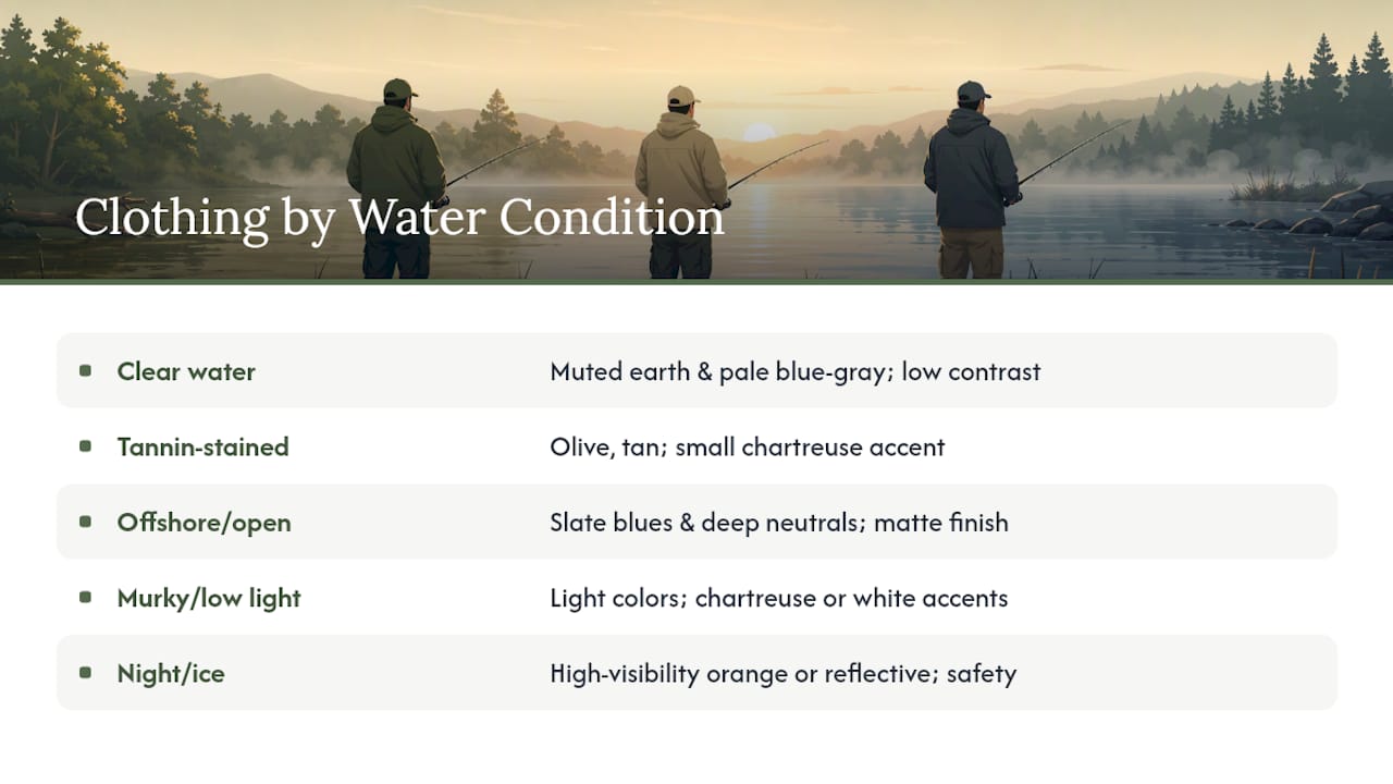
Night fishing and ice fishing are a different game altogether, one where safety outranks stealth. Thermal layers matter more than any color theory, and a high-visibility piece, like an orange beanie or a reflective strip, isn’t a mistake. It’s what gets you found.
Why Fish See Color the Way They Do
Fish vision isn’t uniform, and that’s the detail most casual advice skips. Peer-reviewed research on fish visual systems shows that species and habitat drive huge differences in what fish detect, including ultraviolet light that human eyes can’t register at all. A trout in a shallow, sunlit creek and a grouper forty feet down are working with two completely different visual systems.
Water itself changes the picture before a fish’s eyes ever get involved. Long wavelengths like red and orange get absorbed near the surface, while blue and green push deeper into the water column, so colors shift and fade the deeper you go. A shirt that reads as tan on the dock might look flatter, grayer, and less distinct twenty feet down.
Then there’s Snell’s window, the cone of light directly above a fish’s head where the surface acts almost like a window to the sky. Anything inside that cone shows up in sharp silhouette against bright sky, which is exactly why a high-contrast chest panel or a white collar can flag your presence before you’ve made a single cast.
The takeaway is simple even if the science isn’t: dress to blend with the water and sky around you, not to match one “correct” color. Since color shifts with depth and light, the safer strategy is minimizing contrast rather than chasing a perfect shade.
The 3-Color Rule for Fishing Outfits
Building a fishing outfit doesn’t require a color wheel, just one repeatable rule.
- Pick one muted base color as roughly 60% of your outfit, something like olive, sand, or slate that matches the water and bank you’re fishing.
- Add one low-contrast secondary tone, close in value to your base, for the rest of your layers, such as a slightly darker or lighter shade of the same family.
- Reserve a small accent color for something low on your body, like a boot lace, hip pack, or interior cuff, never a chest or shoulder panel that faces the sky.
Wading anglers should apply this to waders and jacket together, keeping the brightest item, if any, at the belt line. Boat anglers have more freedom on their lower half since fish rarely see below deck rail, but hats and shoulders still count. Cold weather layering just means applying the same rule to your base layer, mid layer, and shell, so you don’t accidentally stack three different bright colors on top of each other by accident.
Balancing Stealth With Heat and Sun Safety
Muted colors help you stay unseen, but they come with a real tradeoff worth planning around. Dark, heavy fabrics absorb more heat, which means more sweat, and more sweat and heat can mean more discomfort and fatigue over a long day on the water.
That doesn’t mean abandoning your palette, it means choosing fabric weight and weave with the same care you choose color. Look for UPF-rated fabrics, which block UV without forcing you into a lighter, more visible shade. Most quality UPF shirts come in olive, slate, and tan anyway, so you’re not sacrificing stealth for sun protection.
Season matters here too. Summer sight fishing under a high sun leans toward lightweight, breathable, matte fabrics in your muted palette, since heat becomes the bigger risk. Cool spring mornings give you more flexibility to prioritize stealth over ventilation.
Pro Tip: Pack a dry change of clothes for the ride home. Sweat-soaked fabric holds odor, and a fresh shirt after a long day on the water beats sitting in a damp one for the drive back.
Patterns and Finishes That Spook Fish (It’s Not Just Color)
Color gets most of the attention, but pattern and finish matter just as much in clear water. High-contrast patterns and plaids create visual noise that reads as unnatural against a calm river or flat, and busy patterns and bright colors can create anomalies that alarm fish, the same way a bold hunting jacket in a treestand does.
Glossy or reflective finishes cause a second problem: glare. A shiny logo print or reflective piping catches light and throws it straight up into that Snell’s window cone, undoing all the work a good muted color choice already did. Matte inks and finishes solve this quietly, without asking you to change your palette at all.

One more factor rarely gets mentioned: scent. Heavy, heat-trapping fabrics that leave you sweating more can leave stronger scent cues behind, which matters more for some species than others. A quick rinse or a scent-free detergent for your fishing shirts is a small habit that costs nothing.
Palette Ideas Built Around Real Fishing Scenarios
Good color choices come from matching your clothing to the specific water you’re standing in, not from picking a favorite color and hoping it works everywhere.
- Sandy flats: tan, bone, and pale blue-gray mimic sand and open sky, ideal for bonefish or redfish sight fishing where every shadow matters.
- River and weed flats: olive, moss, and deeper tan blend with vegetation and stained current, useful for trout water where you’re often within casting distance of spooky fish.
- Offshore and open water: slate blue and charcoal in matte finishes cut glare off open water while staying cool enough for a long day on deck.
- Overcast dawn: soft gray and muted navy work well when the sky itself is flat and low contrast, matching that early light before the sun clears the ridge.
Keep any logo or graphic small and tonal rather than bold, and place it low on the body, on a sleeve or hem, rather than dead center on the chest. First Rise Outfitters builds around this exact idea, with an earth tone color palette pulled straight from river and mountain scenery instead of a marketing mood board. If you’re piecing together a full look rather than a single shirt, a few fishing outfit ideas built around the same low-contrast logic are worth a look before you shop.
Your Pre-Trip Color and Gear Checklist
Run through this before you leave the driveway, not after you’re already standing in the water wondering why the fish went quiet.
- Primary base color chosen to match your specific water, not just your closet.
- Secondary tone close in value to your base, no jarring jumps in brightness.
- One small accent color, placed low on your body, away from the chest and shoulders.
- UPF layer packed for sun exposure, in a shade that still fits your palette.
- Polarized sunglasses, which matter as much for reading water as any color choice you make.
- Dry change of clothes for the ride home.
If the water clears up mid-trip, shift toward your most muted option. If it’s murkier than expected or the light is fading fast, that’s your cue to let a little more chartreuse or white creep into your accents.
A Dawn Angler’s Case for Muted Colors
There’s a specific kind of quiet that happens on the water before the sun clears the treeline, and it’s worth protecting., and that early window shaped a strong opinion: bright gear doesn’t just risk spooking fish, it works against the whole point of being out there before anyone else…
The gear that holds up in that window isn’t the loudest piece in the closet. It’s the shirt that already looks a little worn, in a color that disappears into fog and low light instead of announcing itself. That’s not a marketing angle, it’s just what actually works when the fish are still deciding whether the day feels safe. Anyone who’s stood in a river at first light knows the difference between gear that blends in and gear that just looks good on a hanger. First Rise Outfitters exists because that difference matters to the anglers who show up before sunrise, gear built for the water, not the parking lot.
— Bobby
Where First Rise Outfitters Fits Into Your Fishing Wardrobe
This brand targets anglers who’d rather blend into the river than stand out on the dock. Their badge tees are printed on garment-dyed Comfort Colors blanks in muted, river-inspired tones, following the low-contrast rules covered above.
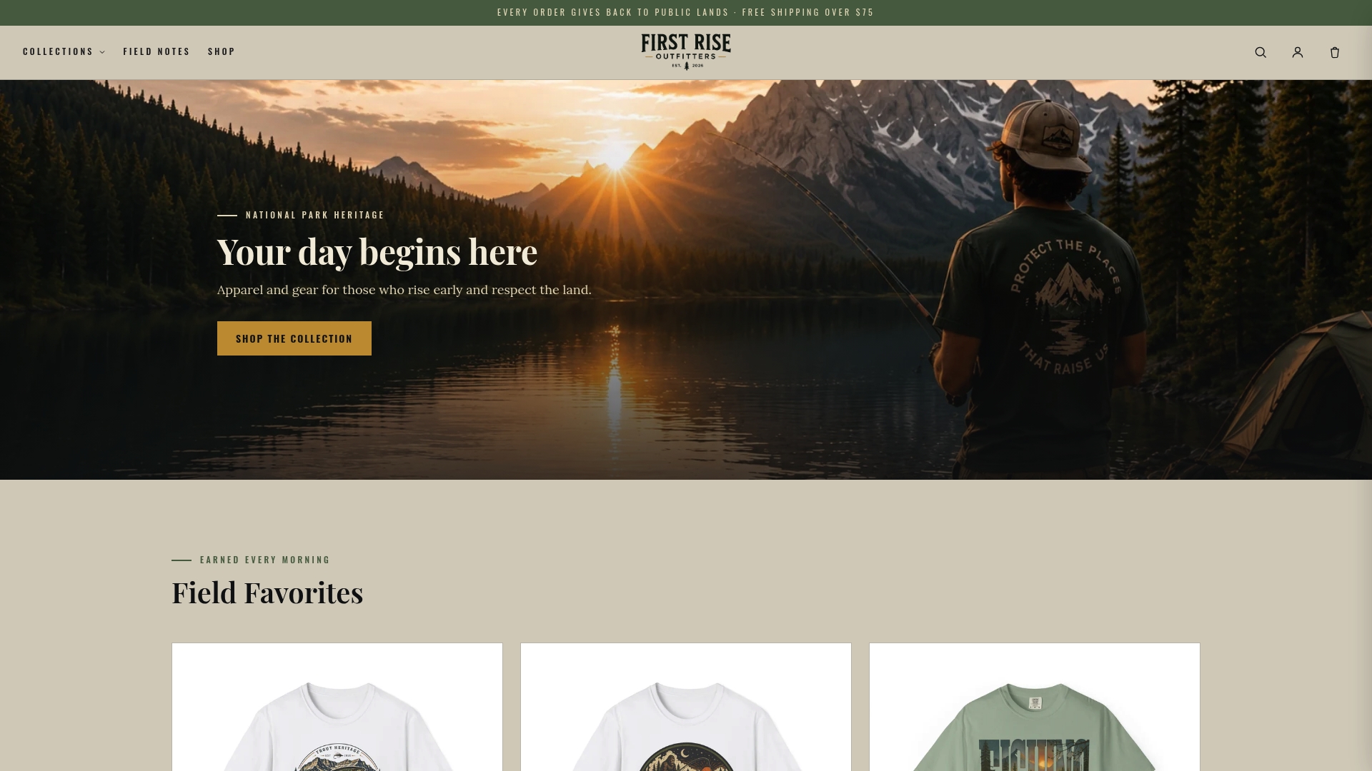
You won’t find neon graphics or glossy tech-bro logos here, just hand-designed trout artwork in shades that hold up whether you’re wading a tannin-stained creek at dawn or sitting on a boat deck at noon. The Trout Heritage collection is a solid starting point if you want a few muted, palette-aligned options in one place, and pieces like the Brook Trout Fishing T-Shirt show exactly how that river-inspired color story looks on a garment-dyed blank. Pick a shirt built around the same colors fish are used to seeing, and wear it before the sun clears the treeline.
Sources
For deeper reading on fish vision and color science, start with the review of visual systems and spectral sensitivities in fishes, MeatEater’s breakdown of what colors fish actually see, and Sport Fishing Magazine’s field guide to fish vision.
- Which colors should be avoided when wearing clothes for fly fishing? | Boating World
- What colors do fish actually see? | MeatEater
- Review: Visual systems and spectral sensitivities in fishes (PMC)